1
2
3
4
5
6
7
8
9
10
11
12
13
14
15
16
17
18
19
20
21
22
23
24
25
26
27
28
29
30
31
32
33
34
35
36
37
38
39
40
41
42
43
44
45
46
47
48
49
| <!DOCTYPE html>
<html>
<head>
<meta charset="UTF-8">
<meta name="viewport" content="width=device-width,initial-scale=1,minimum-scale=1,maximum-scale=1,user-scalable=no" />
<title></title>
<style type="text/css">
*{
margin: 0;
padding: 0;
}
html{
font-size: 16px
}
.one{
width: 19.68rem;
height: 300px;
background-color: gold;
position: absolute;
left: 30px;
right: 30px;
}
@media only screen and (min-width: 376px) {
html{
font-size: 17.98px
}
}
@media only screen and (min-width: 820px) {
html{
font-size: 38.61px
}
}
.two{
width: 100px;
height: 100px;
background-color: yellow;
}
</style>
</head>
<body>
<div class="one">
<div class="two">
</div>
</div>
</body>
</html>
|
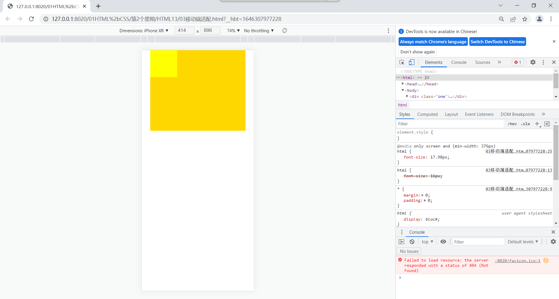
运行结果:
窗口375的iPhone e上运行

窗口414的iphone xr上运行
在iPad air上运行
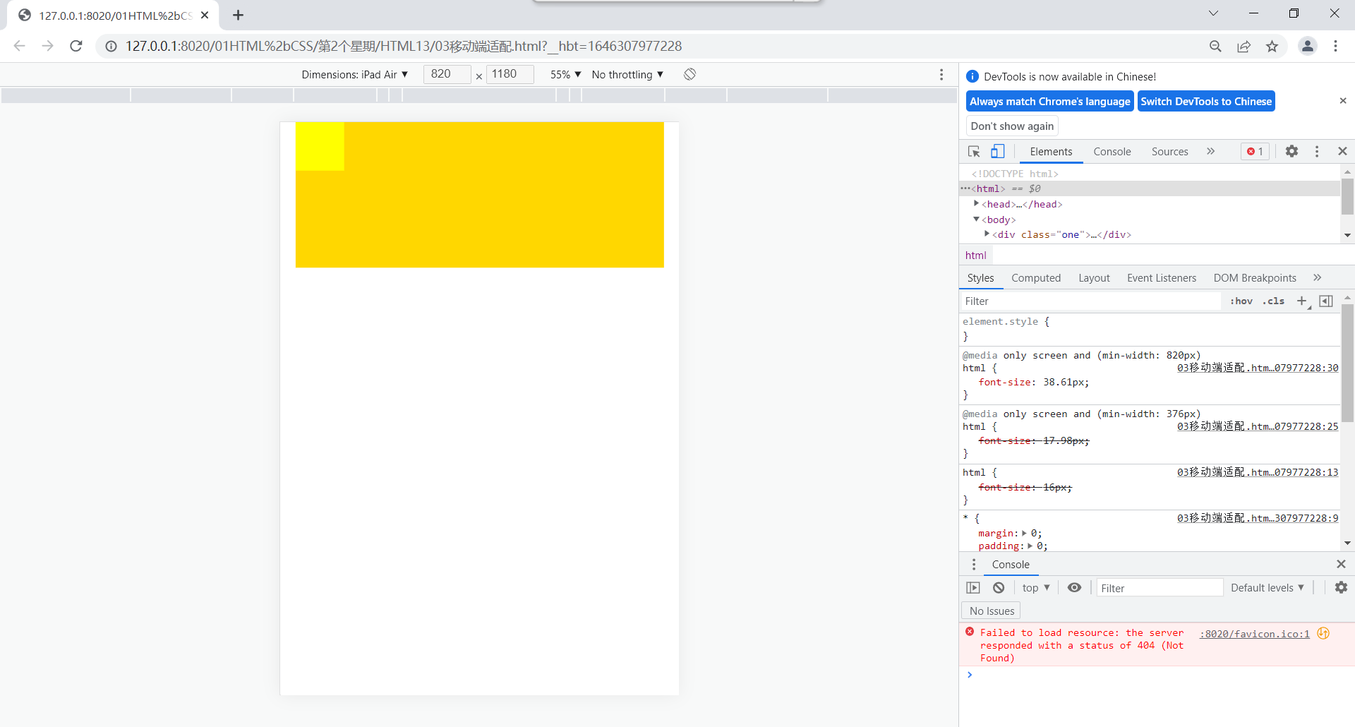
在不同设备上裕兴始终离左右边各30px